Welcome to the Clique Kits Hazel & Ruby Blog Share! If you have arrived from Jody's blog then you are in the right place. If you're just stopping by for a visit please click here to start from the beginning. Today we are sharing projects featuring Hazel & Ruby products. Hazel & Ruby are a fresh and on-trend company with a handmade flair. I love the unique and beautiful products and the whole feel of this company! I am very excited to be sharing my projects with you today using some of their Chalk it Up collection.
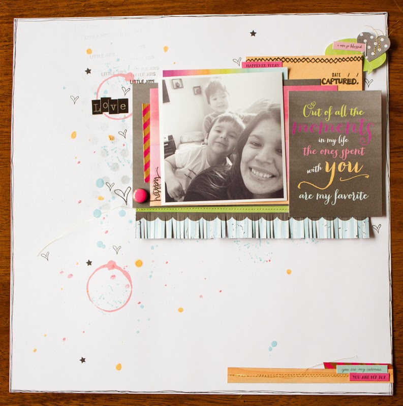
The first layout I want to share with you is documenting a normal day here at home with our two youngest boys! We can not wait for warmer weather so we can get outdoors and we do start to get a little crazy sitting in our home all day! My two youngest are always either at my feet, on my lap or jumping on my back! If you follow me on Instagram you have seen many photos of the three of us! I decided on a black and white photo for this layout and I love how it looks with the beautiful colors in this collection. I also added a little gold stitching to my layout and lots of colorful ink splatters! I am in love with the Chalk It Up Bubbles & Babbles Sticker Sheet and I used it with both of my layouts. And of coarse I could not resit using some of my Pinkfresh Studio washi tape and pink neon brad stickers I think they go perfect with this collection and it is nice to mix in products you already have with fun new collections!
My next layout came together very quickly and I fell in love with the back side of the Chalky Bokeh pattern paper! I love the ombre watercolor look and the colors are fabulous! The photo I am documenting in this layout is of our two youngest and our one and only baby girl. Our mother hen Alyssa is the best big and little sister. She is a tough cookie and keeps close eye on her baby brothers as well as her two big brothers.
Again I kept my layout pretty simple adding a few layers and of coarse a couple hints of pink. I used some more of the Hazel & Ruby Bubbles & Babbles sticker sheet all over my layout and that great camera paper clip that Gia included in out packages is super cute! The inky white circles are from a my favorite stamp set Art Textures.
Your next stop is Lacey's blog and you are going to love what she has to share today! Make sure to leave a comment on each blog along the way for your chance to win a $10.00 gift certificate to the Clique Kits Store. For extra chances to win please follow the Clique Kits blog, share on Facebook, and follow each one of the Clique Kits girls! Make sure to leave a comment for each entry! Have a fabulous day!
Clique Kits
Gia
Jody
Erica
Lacey


I love the fringes!!! Such a freekin cool thing to do along with your inks and circles in the first layout. The second layout's photo just melts by heart, and the rest of the layout's fun bright colors and arrangement rock! Wonderful as always Erica!!
ReplyDeleteAW Erica! These are GREAT!!!!! I adore all your layers and the use of white space! And the splatters on the first layout is awesome! And your kids are so cutE!
ReplyDeletevery cute! what great pictures. So fun. I love the water color. Very vibrant.
ReplyDeleteI love your layouts Erica! Simple but say so much. I love the colors and I love the ombre paper in the second layout. Fabulous!
ReplyDeleteYummy...I love every blog i have been too!
ReplyDeleteFun layouts! I really like how you added the small black/white bag to the layout! I love those things!
ReplyDeleteYou use so many elements that really make your pages pop. I always look at the paper clips and an not sure how they will look, but after looking at everyone's pages I defiantly think I will pick some up and try them.
ReplyDeleteSoooo, what do I love about these besides everything? I do love the little fringy thing on the first one, and I love the use of 'white space' in your composition. I loved that ombre watercolt paper too, and wanted to use it --just didn't have the right photo, and I am still going to go back to that one! I also love that you incorporated so much pattern and texture (like that bold black and white chevron bag), without it being too busy. Bravo girl!
ReplyDeleteLovely layouts.
ReplyDeleteLike the spots
of color used.
Carla from Utah
Love your layouts Erica! The paper in the first one is adorable and I love the bag I. The second one!
ReplyDeleteCute layouts. The little tumble of words is definitely going to find it's way onto one of my pages.
ReplyDelete